The first time I discovered the GA4 user interface and looked at the reporting navigation, as well as the report themselves, I was very concerned. Where did all the reports go? How can I see my data?
Can you relate?
It can be quite disturbing when your favourite analytics tool, one you've been using for years has completely changed. That why this week I am going to share three tips about navigation and report customisation in GA4 that should make your life easier,
- How to customise your left hand navigation report
- How to hide/unhide charts in standard reports
- How to convert a report into an exploration report for deeper analysis
Tip #1 – You can customise your left hand report
It can take some time to find your way around this new menu and you'd not be alone in wanting to run back to the comfort of the Universal Analytics interface. But let’s think positively, as there are some very useful new features in GA4 that can help you here and could improve your analysis.
GA4 has been built for personalisation and customisation. Rather than 78 standard reports out of the box (UA), GA4 has reduced down to 9! This means you have less noise from reports you might not have used, but also more opportunity to add your own.
In fact, you can create additional sub sections (called collections) to access your favourite reports in one click, or to create a new hub for specific user groups….
I highly recommend you start playing with it, and see how beneficial it can be for you and your business. To get you started I’ll show you how…
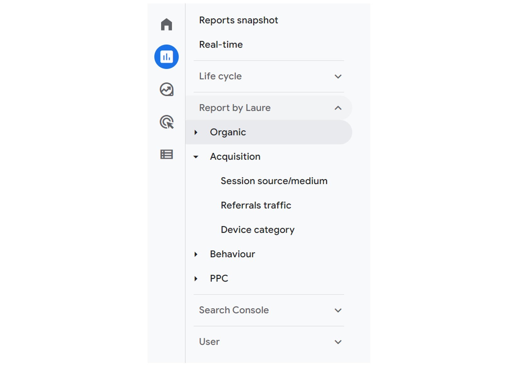
Where to manage your navigation menu in GA4
Firstly let’s get more familiar with some new terms: collections and topics.
A collection allows a cluster of individual reports to be grouped together in the left hand navigation. By default, GA4 has a ‘Lifecycle’ collection and a ‘User’ collection.
Within a collection you can also have sub-categories (GA4 has labelled these as ‘topics’) which allow for further organisation of reports. By default, GA4 has a number of topics for Lifecycle and a couple of topics for User (e.g. demographics and tech).
If you have administrator access to your GA4 property, you will be able to manage them in ‘Library’ which can be found at the bottom of the left hand navigation panel within Reports:

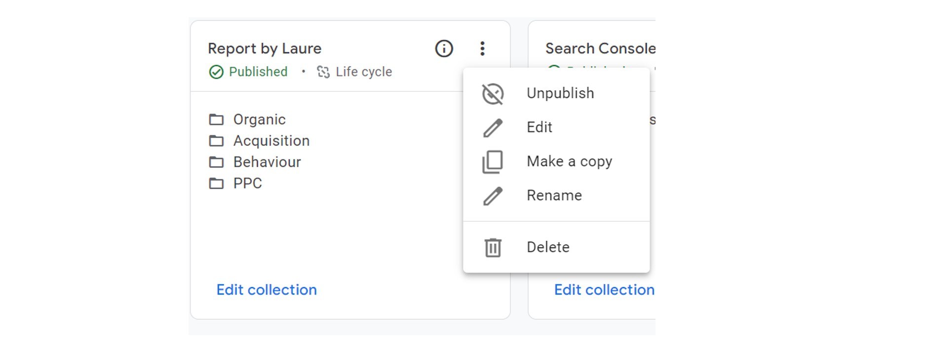
You can create a new collection, topic and report from scratch or edit existing ones in this library. Any user with administrative access will see the same library when logging in, and for those without admin access they should still be able to see the curated collections in the left hand navigation.
This is one area of GA4 that multiple users can see the same information!
Unfortunately, there are only a handful of in-built report templates, and currently you can’t import or share across GA4 properties like you can do with UA’s custom report gallery.
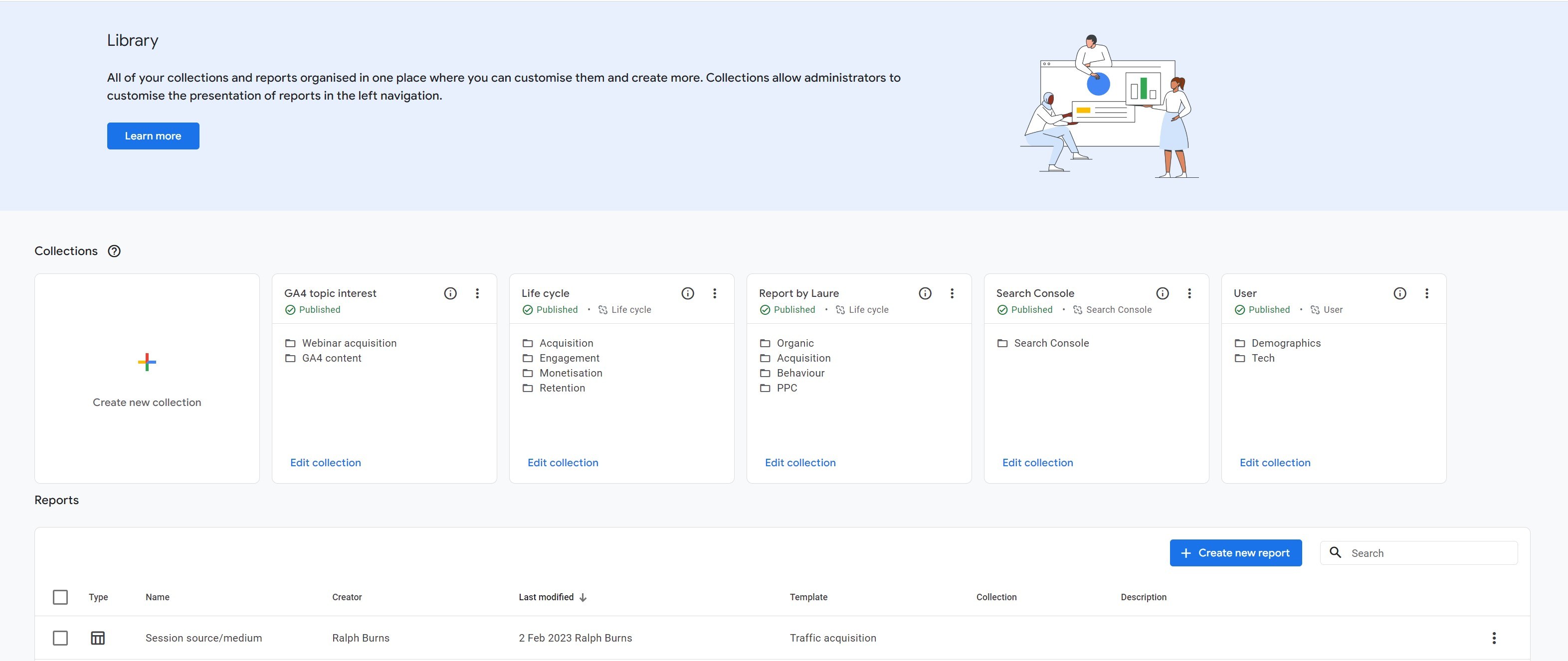
When you create or edit a collection, you will be taken to the collection editor where you can add as many topics as you want, but bare in mind each topic can only have up to 10 reports.
You can either select drag and drop predefined reports or add your custom reports.
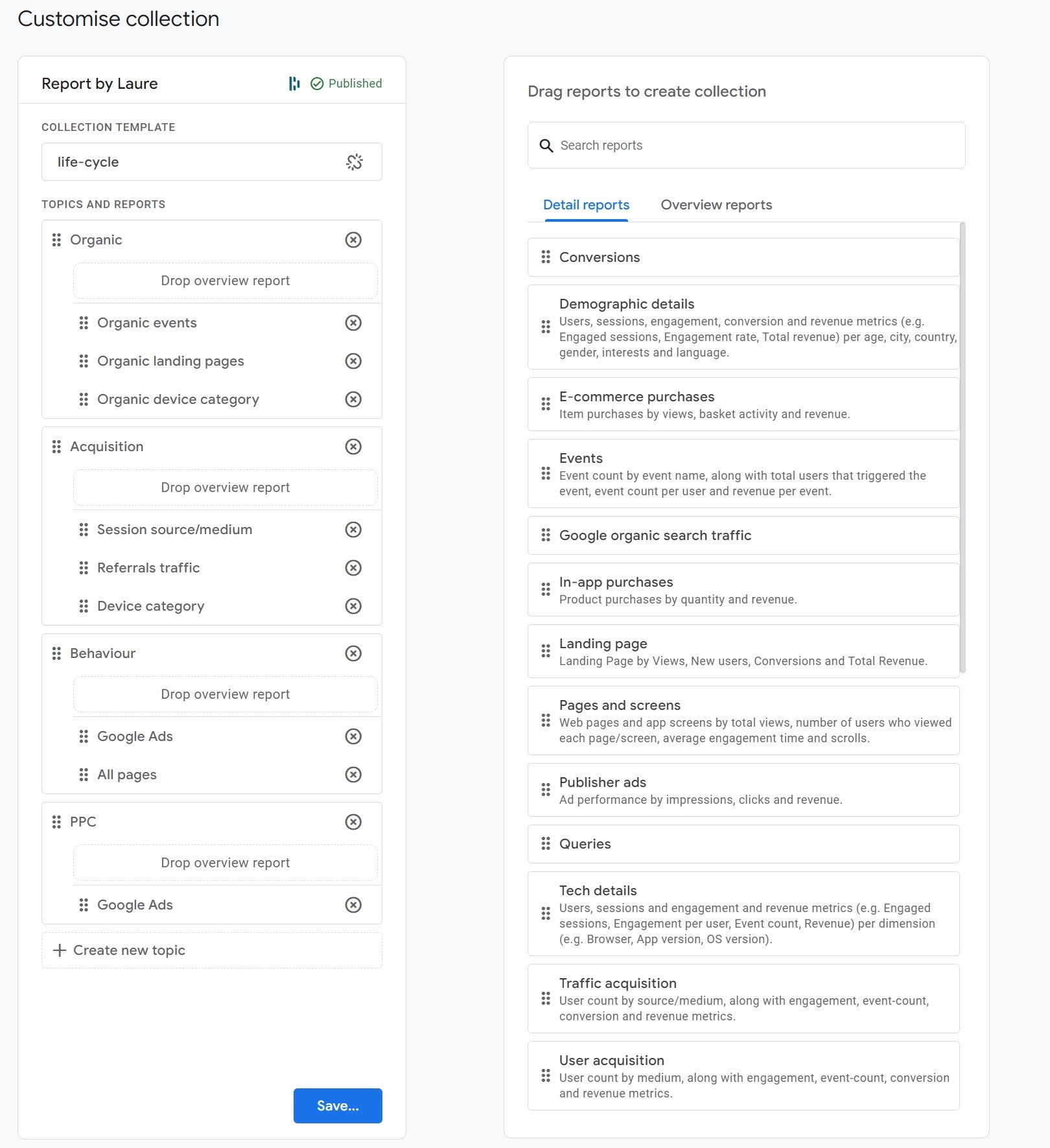
When you are happy with your new collection then you can press save but also make sure your collection is published (see the green label in my screenshot below) if you want it featured in your report reporting menu.
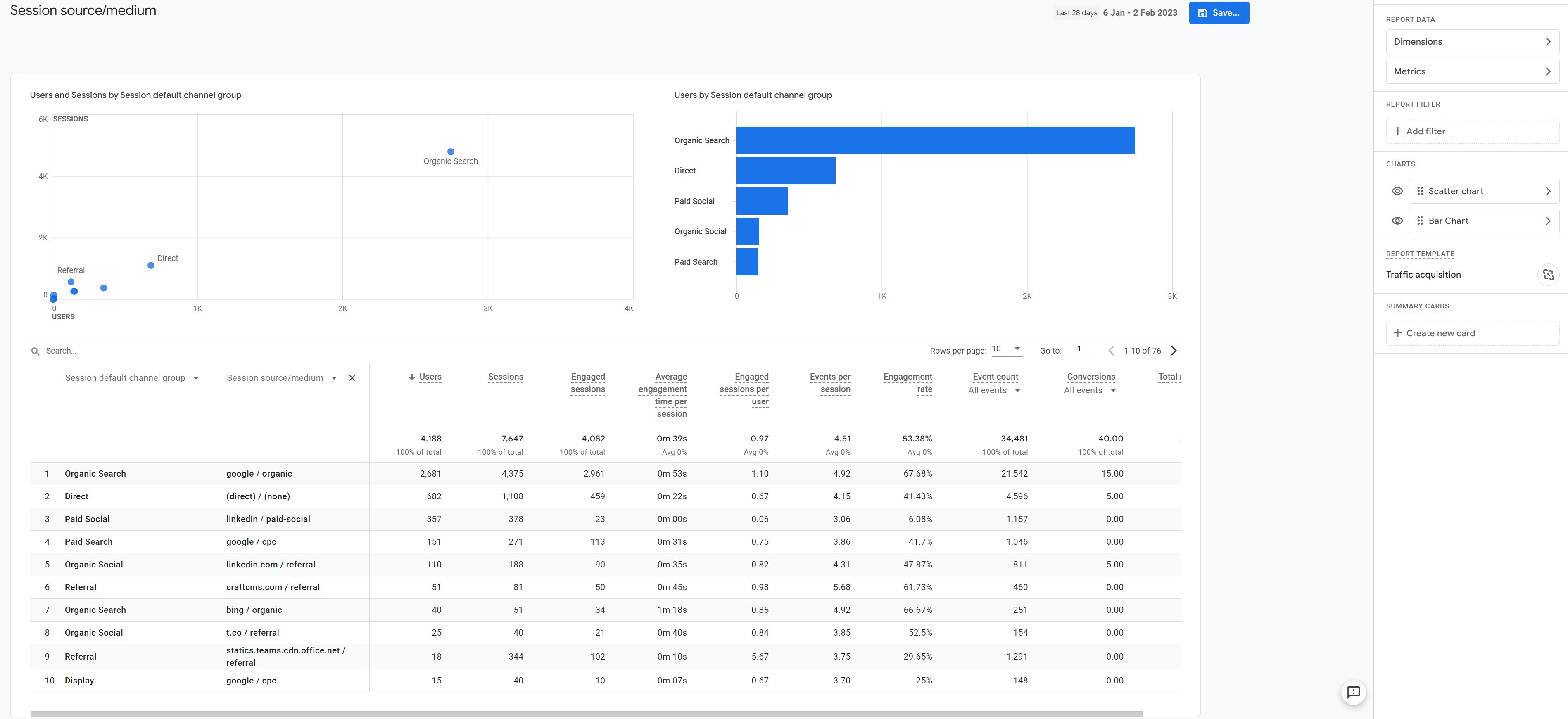
Tip #2 – Hide or unhide charts
If you have read my previous tips and tricks article, you might remember that I don’t really find the GA4 charts within standard reports very useful, and an aggregated view would be more relevant for me. Thankfully you can hide some graphs (otherwise known as cards) within those predefined reports to remove the distraction.
First things first, select the report you want to update and then click on the ‘customize report’ icon to gain access to the customisation view (on the top right) of your screen.

You are now in customisation mode! As you can see, on the right hand side, you have a new sidebar with a series sections, which represent different blocks in the report panel.
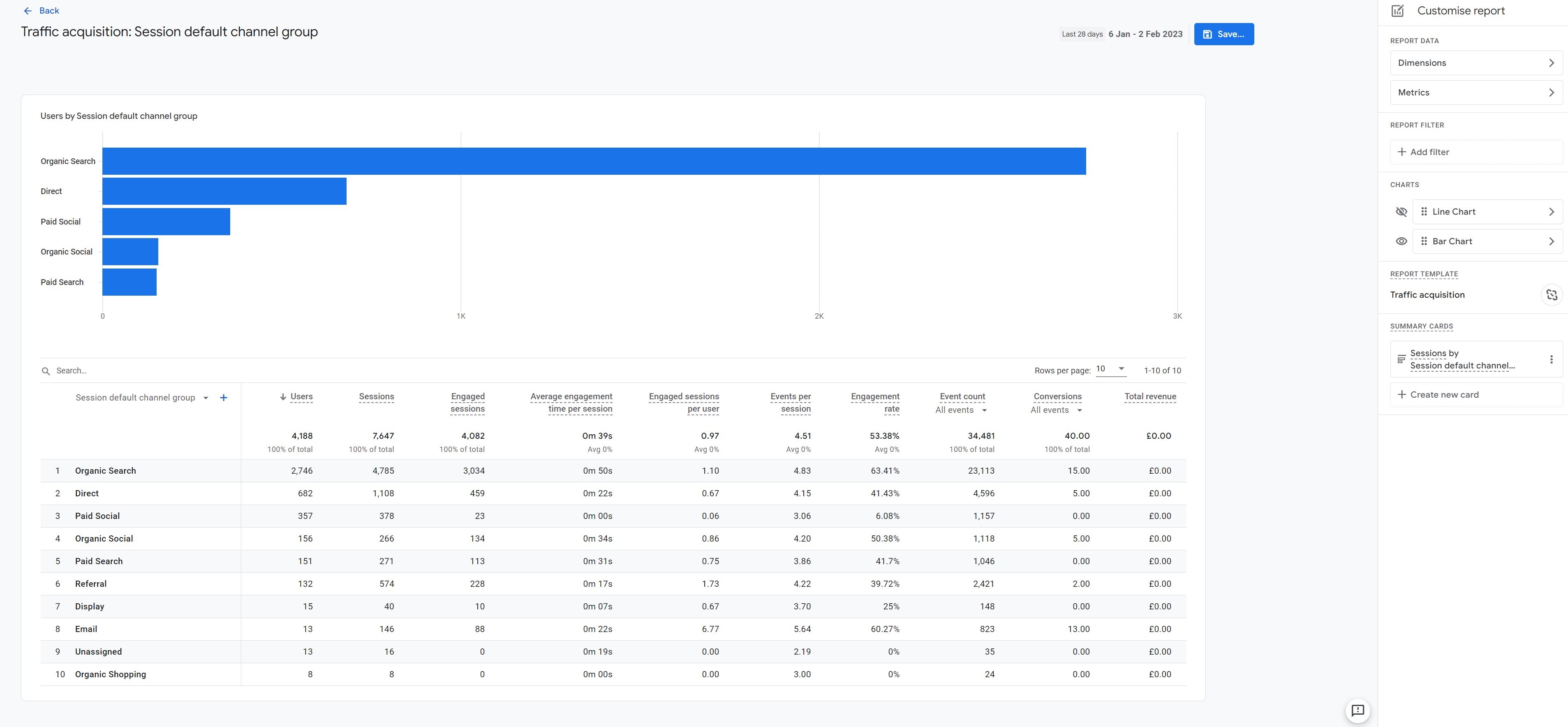
The one we want to focus on in this instance is the ‘charts’ one. This is where you can either hide the line chart and/or the bar chart, depending on your preferences.
You also have the option to replace with a scatter pod chart. I am not a fan of this type of chart, and I still haven’t found a relevant way to use it for me or our clients. And it looks like there is a bug in GA4 when you try to save your report with this type of chart: in fact sometimes it lets you save it and the pod chart is featured correctly and sometimes not.
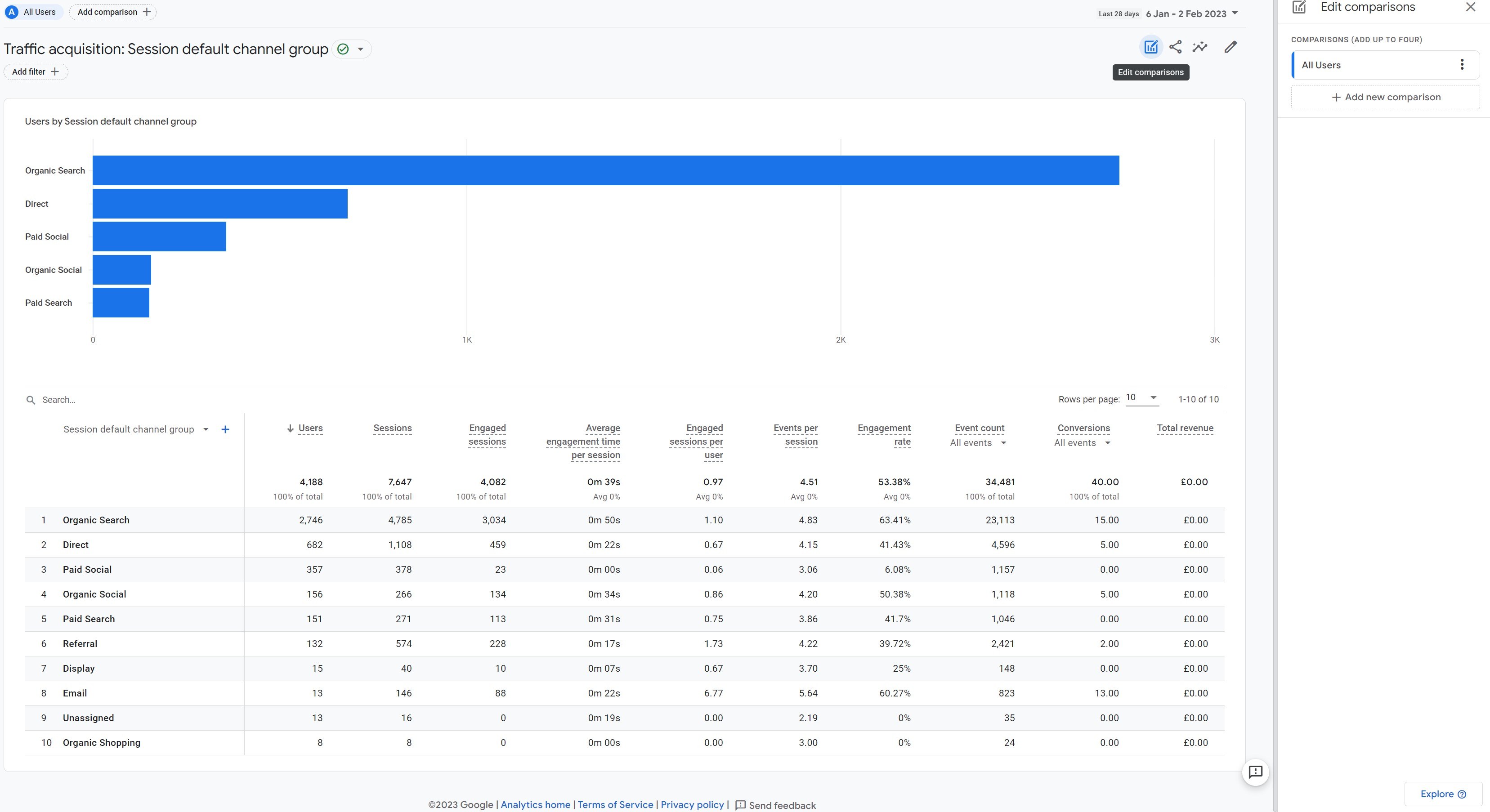
Tip #3 – A quick way to deep dive into analysis from a predefined report
My last tip is something I have recently discovered when I was working on report customisation. In fact, you’ve probably noticed that when you want to customise a predefined report, there are some limitations in terms of dimensions and metrics you can select, filters you can apply, etc.
However, there is a way to get a little bit more flexibility, by moving to an exploration report. This is how you can do it in two clicks.
In this example, I have selected the standard ‘traffic acquisition report’, but you can do this with any report of your choice.
This time you will need to click on the ‘Edit comparisons’ icon, and then on the ‘Explore’ button at the bottom of the sidebar which opens.
There are now lots of new report settings (on the left sidebar) that will give you more flexibility in terms of:
- Method type (Free-form, funnel exploration, etc)
- Visualisation (Table, line chart, doughnuts chart, bar chart, geo map)
- Diversity of dimension and metrics
- Filter usage
Please note that the data retention in an Exploration report is based on the GA4 settings from your GA4 property (2 months or 14 months). And if you haven’t done it yet, we highly recommend switching it to the maximum: 14 months.
There is so much to cover on exploration reports. I will have to save that for another article. In the meantime, I hope these few reporting tips will help you navigate around GA4 with more ease.
Stay tuned! We’ll share more GA4 tips and tricks in upcoming articles.


