Are you ready for Google's latest mobile algorithm update on Tuesday 21st April? Find out what's going to change, what the changes mean for your business, and how to prepare so you can benefit from them.
Tuesday 21st April 2015 may sound like an average day for some but it’s a big one in the digital world, for a mobile-ocalypse is looming. Google has recently announced its updating its algorithm again and this time it’s focused towards mobile users and their online experiences.
Remember the last time you were browsing on your mobile and you came across a site that wasn’t optimised for mobile? You probably needed to swipe side to side to view the text and zoom to click on the tiny links? Chances are you left without fully browsing the site feeling disgruntled - after all, it’s 2015 and there are plenty of mobile-friendly sites out there with great user experience.
Last year, the business landscape changed forever when Internet usage on mobile devices exceeded desktop usage. Now, as 15% of the world’s population own a tablet device and over 25% own and use mobile devices, it makes sense to be providing your mobile users with a tailored, positive experience.
What is Google’s mobile algorithm update?
This Google update is an expansion on the mobile ranking demotion algorithm that was launched back in 2013.
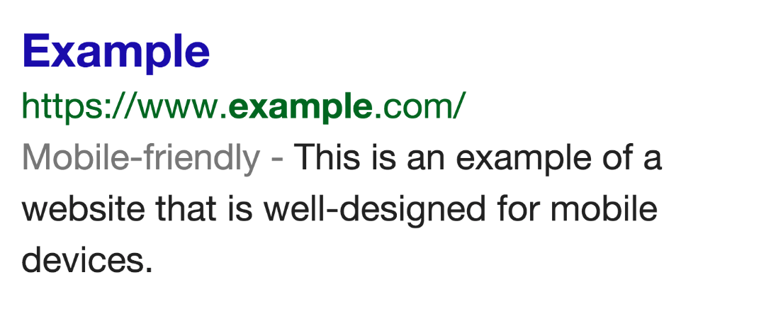
Currently, Google indicates which sites are mobile friendly in their organic search results, however with the upcoming algorithm change Google will actually be rewarding and penalizing sites in the search pages based on their mobile experience.
Google hasn’t exactly specified what will change in their requirements on 21stApril, but based on industry speculation it will affect more sites than the Penguin and Panda updates. One thing is certain: it your site isn’t mobile friendly, you will not be reaping any benefits.

Real time, page-by-page updates
Google’s Gary IIlyes answered questions about the new update at SMX West, revealing that the algorithm will run in real time and is on a page-by-page basis, which is great news.
The fact that it runs on a page by page basis means that if you have 20 pages on your site but only 10 are mobile friendly, these are the ones that that will benefit in the mobile results pages. Google has only just revealed this, which is a relief for webmasters and those who work on sites with specialised sections which would be difficult to make mobile-friendly.
The fact that it’s in real time is great news as this means that once you‘ve made a page mobile-friendly and Google crawls the page again you will see the benefits – extremely good as for previous penalties webmasters would have to wait months and months before Google released another update!
This means that if your pages are slow to be indexed because they are rarely updated, it would be beneficial to make your site mobile friendly sooner rather than later.
Thankfully, Google is giving businesses a heads up before the 21st April update to check whether their site is mobile ready and there are a few tools you can use to check your site meets the basic standards for a mobile optimised website.
How to check your site is mobile friendly
Google has two tools which you can quickly use to check if your site is mobile friendly:
- Google’s Mobile Friendly Test
- Google’s Mobile Usability Report
Google’s Mobile Friendly Test analyses a site’s URL to check if they meet the following criteria:
-Avoids software that is not common on mobile devices such as Flash
-Uses text that is readable without zooming
-Sizes content to the screen so uses don’t have to scroll horizontally or zoom
-Places links far enough apart so that correct one can be easily tapped
There is no in-between stage in Google’s eyes; you either are mobile friendly…
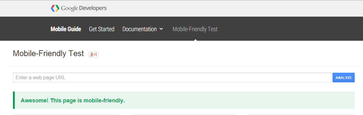

…or you’re not!
For more detail, there’s also Google’s Mobile Usability Report in Webmaster tools. This gives you greater insight into which specific URLs aren’t showing as user friendly on mobile devices and therefore which pages need to be fixed.
What is the mobile algorithm looking for?
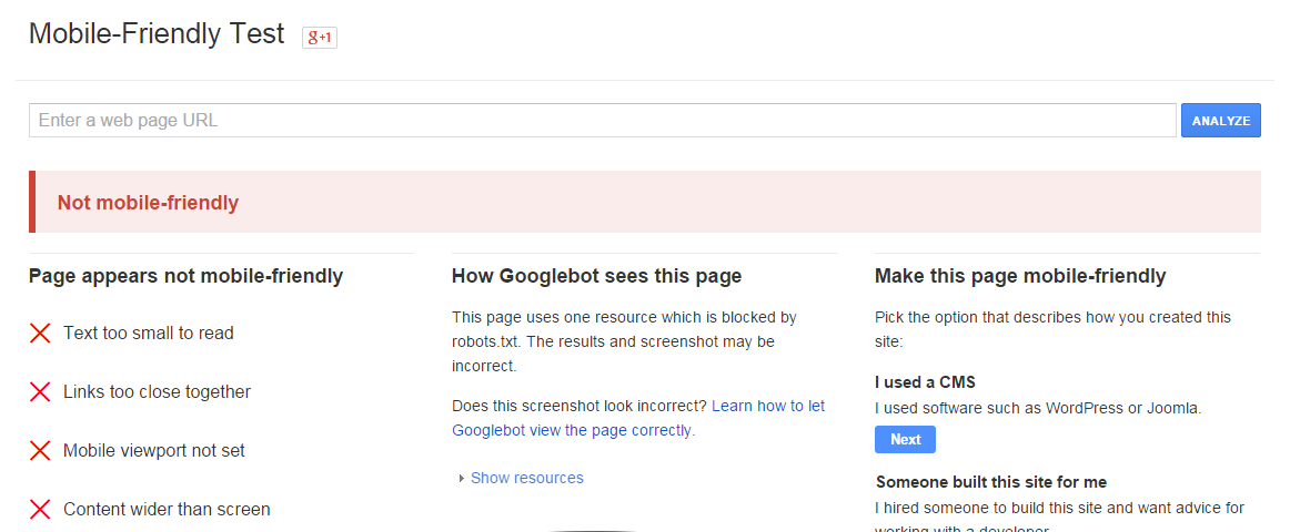
There are a few common reasons why a website won’t pass Google’s mobile friendly test:
1) the text is too small
This is when users have to use the zoom function to read the text on the page.
2) the links are too close together
Links should be big enough and easy to tap with your fingers without accidently tapping a different link or having to stretch your thumb too far.
3) the mobile viewport isn’t set
The mobile viewport controls the width of the page for each device, so for example if the viewport isn’t set when a mobile user visits your site they may be presented with the desktop landscape (if your site is responsive the site will automatically be adjusted to fit the viewport based on the device).
4) the content is wider than the screen
The content may have been set wider than the mobile device’s parameters, meaning the user would need to scroll from left to right to read all of the text.
Resolving these issues will make a page mobile friendly, however it is important to go through each page individually as the update will be rewarding and penalising pages on an individual basis.
Get ready for the mobile change: create an action plan
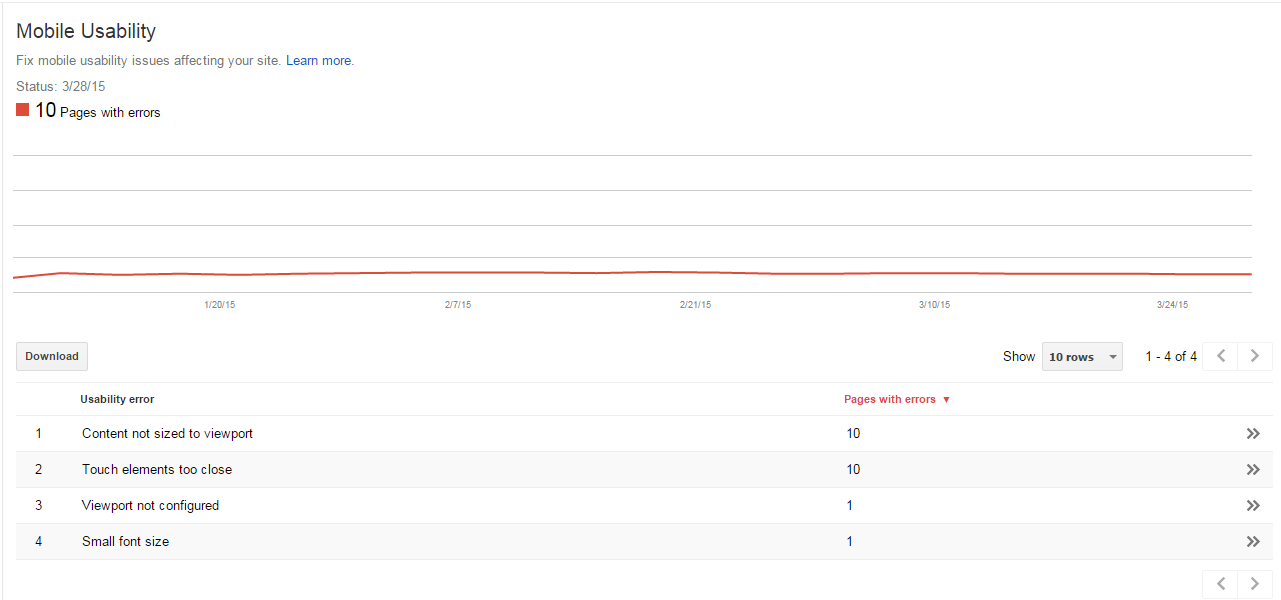
In order to get ready for the algorithm update you should look to create an action plan for your business. Google’s Mobile Usability Report will tell you which pages haven’t been optimised for mobile, next you need to prioritise the pages in order of impact to your business.
Check mobile engagement in Google Analytics
Once you’ve identified the pages that aren’t responsive you can then go into Google Analytics and investigate mobile usage by adding an organic segment under Audience > Mobile > Overview. This will give you a breakdown of how much of your traffic comes from desktop, mobile and tablet and give you an overview of mobile engagement – in particular look at bounce rate, pages per session, average session duration and goal completions. Adding together the information from mobile and tablet will indicate how much is at stake for your business.
It’s also wise investigating how your organic landing pages are performing on mobile. Cross-checking this with the list of URLs that aren’t mobile-friendly will again give you a clearer idea of which pages hold the most value to your business and will help prioritise which pages need to be made mobile-friendly as a matter of urgency.
Check mobile rankings
As an additional piece of information, you can check your current mobile rankings using a ranking tool such as AWR. This will help you going forward by first checking in analytics which keywords are driving business to your site; the tool will then give an indication which position your site is showing in on mobile for each keyword, which you can then work on improving.
With these rankings, one thing that is certain is that if your core pages aren’t mobile ready it is likely that you will see these rankings fall as Google moves mobile-ready sites up to the top pages.
So, are you ready?
If you would like to talk to a member of the team about how you can be mobile ready contact us


