In this blog post, I will discuss common UX mistakes that often lead to user frustration and a high likelihood of users abandoning their journey.
What I will be covering:
Thumb reach and accessibility on mobile
It’s essential to ensure that all user actions are easily accessible within the reach of the user's thumbs. This necessitates studying various device sizes and considering the placement of elements on the screen to accommodate both a left-handed and right-handed audience.
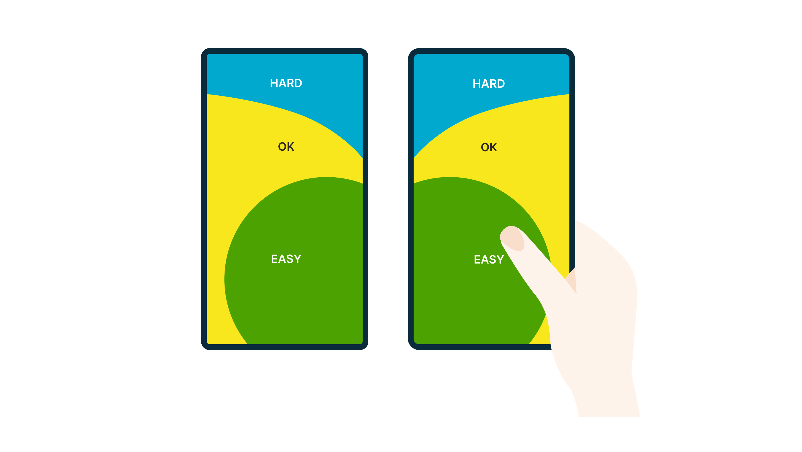
The ‘easy area’ depicted in the image above is the most accessible region on mobile devices. Consequently, the majority of interactive elements need to be placed within this area. If users are required to constantly stretch or switch hands to access features outside of this area, they are likely to become frustrated and may exit the website or app.
This is precisely why I have always found it puzzling that the hamburger menu is typically placed in the top right corner. Some companies are now adopting a navigation placement at the bottom of the screen, which aligns better with user accessibility and reduces frustration.
Button and content hierarchy
As designers, a fundamental part of our role is to consider how users naturally scan content and the sequence in which they react. It goes beyond simply making buttons obvious and clear.
In this discussion, I would like to explore how users typically scan a page and the optimal placement of buttons.
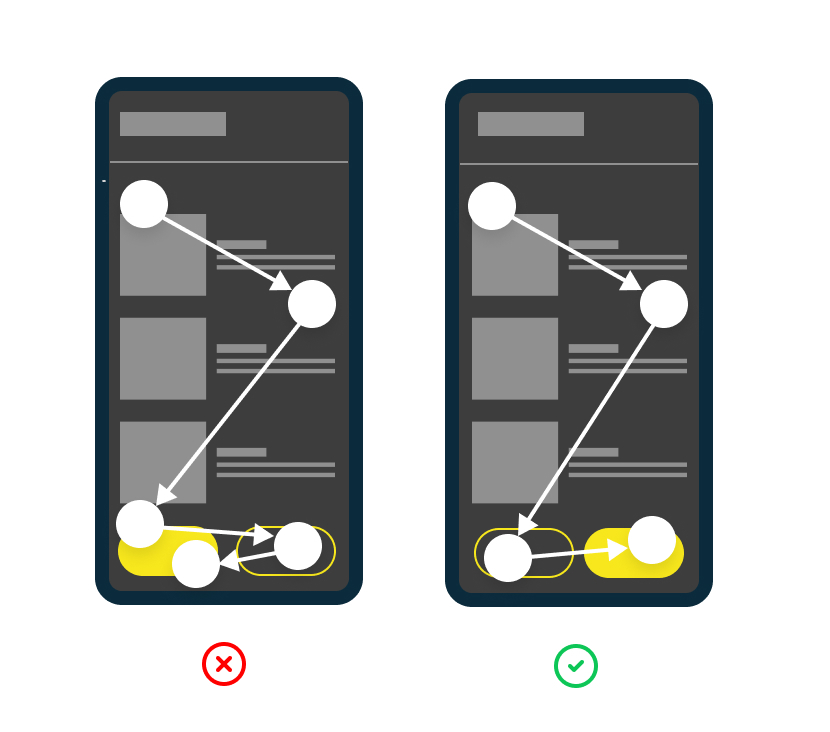
Two call to actions side by side:
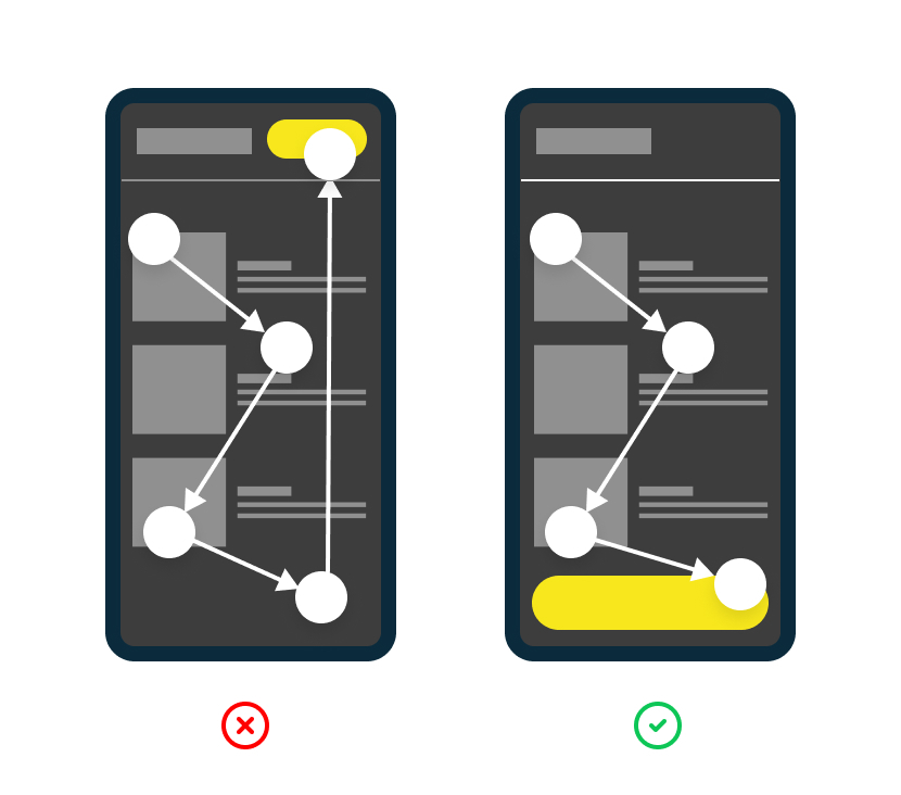
If I hadn't conducted research, I would have assumed that placing the primary Call-to-Action (CTA) on the left side of a page was more effective, considering users read from left to right. After all, it would be the first button they encounter. However, user behaviour indicates that individuals prefer to view all content before deciding on what action to take. Therefore, positioning the primary CTA on the right-hand side facilitates a quicker and easier user experience.
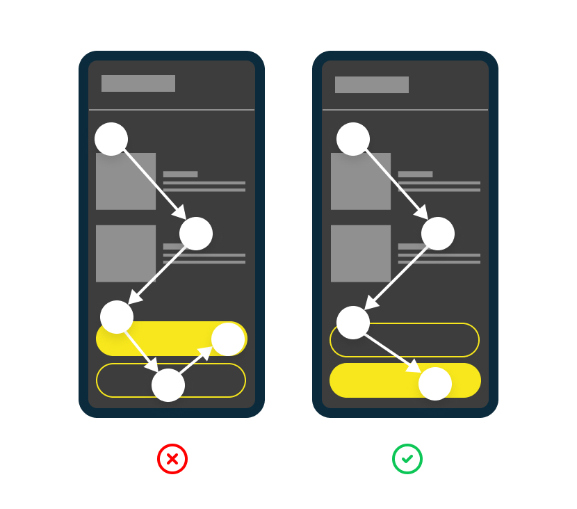
Two call to actions on top of each other:
The topic I'm about to discuss may be controversial, but evidence suggests that placing the primary button underneath the content is the most user-friendly approach. Similarly, when considering side-by-side placement, positioning the primary button as the last item is found to be most effective. This strategy aligns with user behaviour, as individuals tend to scan all content before making a decision on their next action.
Call to action in header:
In my opinion, I would consider this placement to be the least favourable. It requires users to scan through all the content and search for where they initially encountered the CTA, which may now be out of view or off the screen. This can lead to a frustrating user experience as users struggle to locate the CTA they saw earlier.
Primary vs secondary buttons:
Frequently, the correct usage of primary, secondary and tertiary (styled links) buttons is not implemented. The primary button serves the purpose of drawing attention and should be used sparingly or limited to one instance on a single page. This allows UX designers to guide users along a specific path based on the primary CTA. For instance, on a product page, the main CTA would typically be ‘Buy now’. Using an excessive number of primary buttons can confuse users and hinder their understanding.
However, there are exceptional cases where two primary buttons may be necessary. This occurs when you need to provide users with equal opportunities to respond or answer a question.

Buttons in modal:
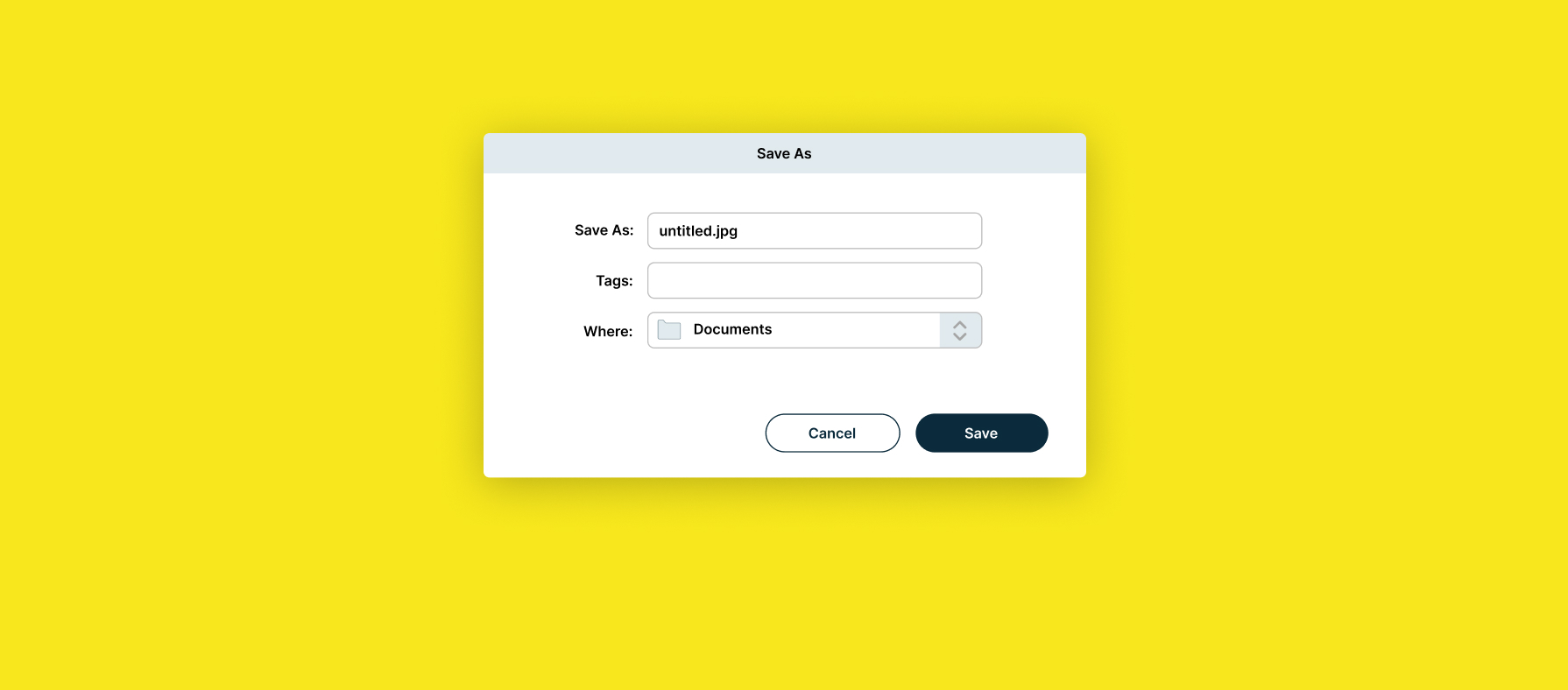
Let's begin by discussing the purpose of a primary button, which is commonly employed to direct users towards a specific action or path. For instance, in a ‘Save as’ dialog box, the modal interface emphasises the importance of saving rather than cancelling. As a result, the primary button, typically labelled as ‘Save’, is more prominent and obvious to encourage users to proceed with that action.
Buttons on a page:
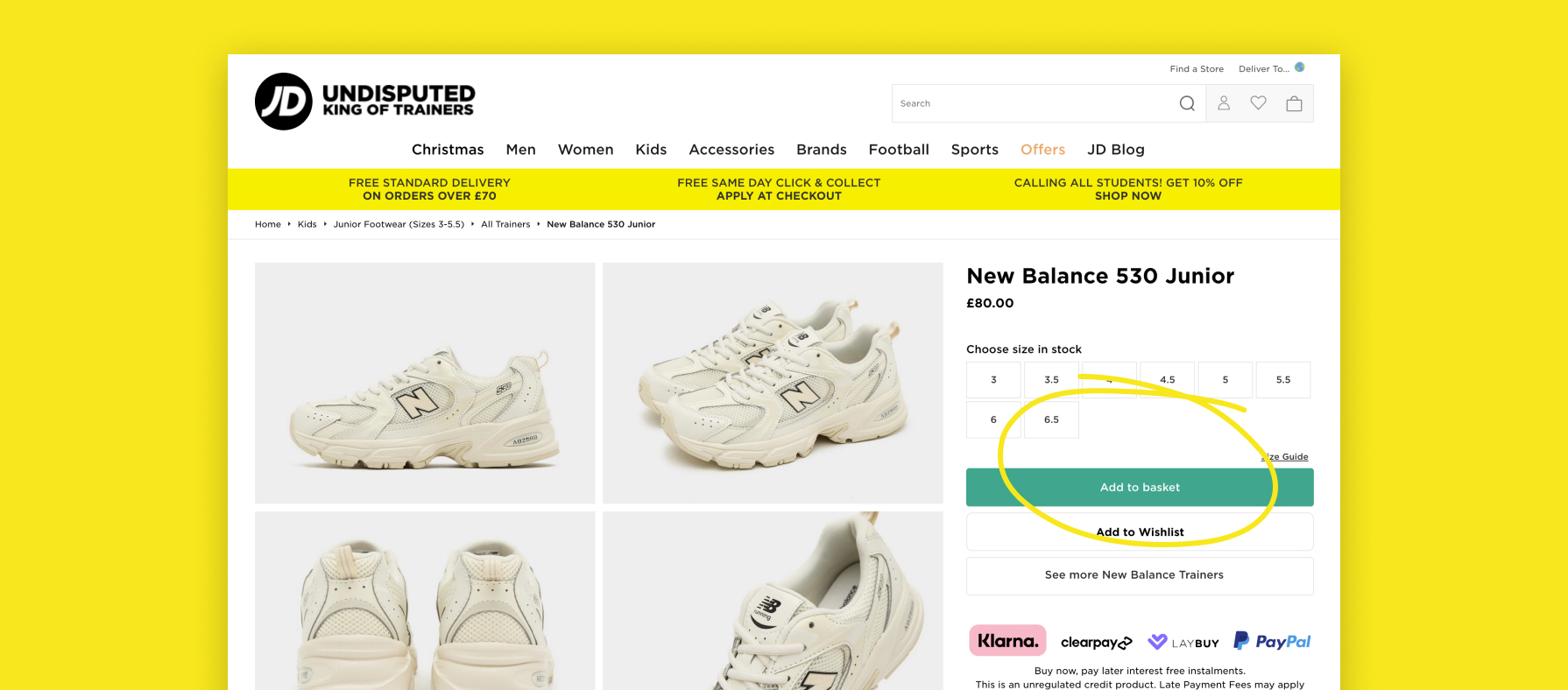
As a general guideline, it is wise to limit the usage of primary CTA buttons to one per page. The primary CTA represents the main action that you want users to take. A product page serves as a good example of this principle, where the ultimate goal is to encourage users to make a purchase. In such cases, the main CTA would typically be ‘Add to Basket’, while the secondary CTA might be ‘Add to Wishlist’. Although the designer still wants users to add items to their Wishlist, they prioritise and prefer that users add products directly to their basket.
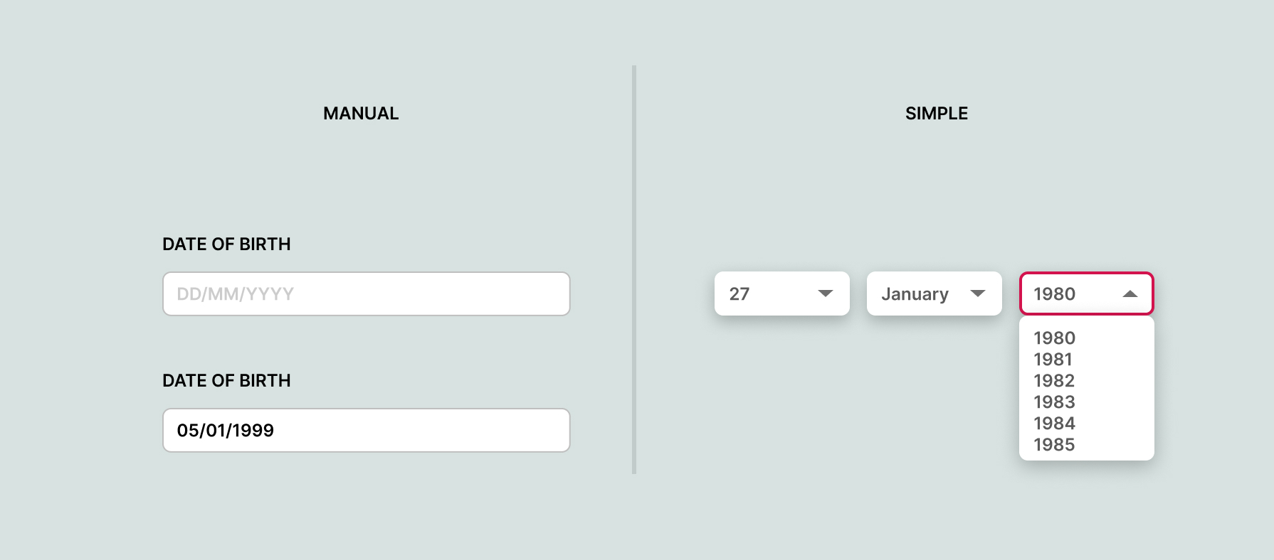
Using correct date pickers:
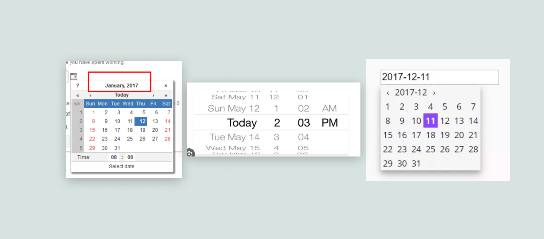
I have encountered numerous instances where I felt frustrated with the usage of date pickers in certain scenarios. There is nothing more exasperating than having to manually search for a specific date within a lengthy dropdown menu.
Date picker for date of birth:
Time and time again, I’ve found myself in situations where I needed to select my date of birth, and upon clicking into a date picker, I was faced with a calendar. The process involved selecting the year first, which meant scrolling back several decades from the current date. Then, I had to choose the month and finally locate the specific day of the week on which I was born. This convoluted process left me completely baffled and would undoubtedly frustrate many others as well.
The most effective UX approaches to this are:
1. When it comes to inputting dates, allowing users to manually type in the date can be a much more efficient approach. If users are presented with the format DD MM YYYY, it is highly unlikely that they will have any difficulty understanding it. By clicking into the designated field, a number field appears (especially on mobile devices), enabling users to simply enter their date of birth without having to navigate through a calendar or dropdown menu. This method offers a quicker and more user-friendly experience for entering dates.
2. Using drop-down fields for selecting the day, month, and year (DD MM YYYY) is another approach, although not as efficient as the manual input method mentioned previously. However, it can still be effective in certain cases. To enhance usability, setting the default year to a range like 1980-1990 can help users avoid excessive scrolling to find their birth year.
